Anne Rackham had her origins in an idea I worked up in mixed media on plyboard in the autumn of 2018. The idea didn't come to anything and the wood ended up being recycled in other artwork. Fortunately, I had photographed it before destroying it and in the intervening years I was occasionally drawn to the image as it slowly grew on me.

Finally in the summer of 2025, I decided to revisit the idea and work up a new version fairly faithful to the embryonic idea captured in the photograph. A trip to Rome in 2024 where I had marvelled at Caravaggio and Velázquez masterpieces, helped cement a commitment to oil on canvas as the painter's medium par-excellence. As I had witnessed first-hand, a well-made oil painting on canvas has the potential to be appreciated for hundreds of years, so the materials of this piece was decided. I had a canvas stretched on a 100 x 100-centimetre frame which is my favourite size currently - not too big to fit in the back of a car, not too small to be lost on a busy wall. In addition to the usual priming of the canvas, I had applied a dark coat of mixed ultramarine and cadmium red oil paint; which I often prefer than starting on a white or off-white canvas. By the time I started work in earnest in mid-July, this initial coat had been dried several months. After seeing how well the dark primer coat worked after my initial workings, I abandoned the original colour scheme, opting instead for the more sombre palette. Over the next three months multiple layers of thinned oil paint were painstakingly added making the colour radiate with luminous intensity. Initially, I started with light grey central spaces but changed this later to the lightened ultramarine of the finished work.

Seeing the power of that deep blue with the rich burgundy ground and the dark grey forms was one of those moments that a painter lives for. The final piece was rubbed down in places to provide a luxurious satin finish, meaning its luminosity changes with the light as the day progresses. Below are some pictures of it hung under artificial light at an art fair in October 2025.
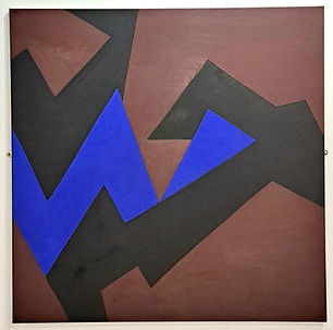

As with much of my work, it's a play on the poetry of colour and space. Because the shapes are not readily identifiable with objects in the material world, the spectator's eye is disoriented trying to make conventional sense of the different areas of the composition; maybe perceiving an area as form one moment and as space another. These dualities of form and space are intentionally ambiguous and difficult to pin down but part of the craic of getting to know the piece. Compared to much of my quite aggressive, uncompromising work of recent years this seems to me a gentler work of a more feminine quality. Hence the name. I didn't want a dry, descriptive title that's often applied to abstract art. Anne Rackham is fictitious, but I knew a few Rackhams growing up and Anne was a common woman's name in my childhood town. I'm very proud of this beautiful piece, but it's low contrast and narrow tonal range, make it very difficult to photograph and therefore comprehend properly in digital format. It really needs to be seen physically. The art is the encounter. If you are interested in owning this, I would strongly recommend we arrange a private viewing at your place before any final decision to buy. I would be happy to lend it out for an agreed period, so that you can try before buying.